Medicare Insurance Comparison and Selection Usability Testing
Overview
Summary
Conducting usability testing on a Medicare insurance comparison experience.
My Role
Lead Researcher
Responsibilities
Goal setting | Stakeholder reviews | Script / Discussion guide creation | Moderation | Analysis | Report writing | Present findings
Worked with
Researchers | Designers | Product Owners | Medicare SMEs
Company
CVS Health
Artifacts created
Script / Discussion guide | Test plan | Final report
Tools
Figma | UserTesting.com | Word | PowerPoint
Goals
Our goals focused on:
- Observing if users are able to successfully understand and interact with the content in this flow.
- Observing how easy or difficult it is for users to complete the process.
- Receiving feedback on the new design in the current iteration.
Methodology and Recruitment
For this test, a total of 6 participants were recruited using an online remote testing platform to conduct moderated usabilty testing.
Participants were recruited based on Medicare and other healthcare related criteria. Below are a couple examples of screening questions asked:
Where in the process are you at with regards to enrolling in Medicare?
- I haven't yet begun looking into Medicare plan options.
- I'm planning on enrolling in Medicare within the next 6 months.
- I'm already enrolled in Medicare.
- I'm currently enrolled in other health insurance and will not be enrolling in Medicare this year.
- Other / none of the above
How comfortable are you researching Medicare options online?
- Very comfortable
- Somewhat comfortable
- Neutral
- Somewhat uncomfortable
- Very uncomfortable
The Test
Prior to users interacting with the prototype we wanted to understand the participant's current Medicare experience. Below are a few examples of introductory questions that were asked:
- Describe for me where you currently are at in terms of understanding and selecting a Medicare health plan?
- What do you hope to find online that would help you understand and select the right Medicare options for you?
- What plan or coverage options are you hoping to find?
- (If user is already on Medicare): Thinking back to when you enrolled or changed to Medicare, how did you go about understanding Medicare health insurance?
These types of introductory questions gave us a brief glimpse into how a participant may have approached finding and enrolling in a Medicare health plan as well as easing into the session before completing the core test tasks.
The primary part of the test would focus on users interacting with the newly designed prototype. A brief, overarching task would be given to participants to direct their focus. E.g.:
- Imagine that you’re shopping for Medicare insurance plans and you are trying to find the plan that will be the best fit for you. You’ve come across a website to shop for Medicare plans...
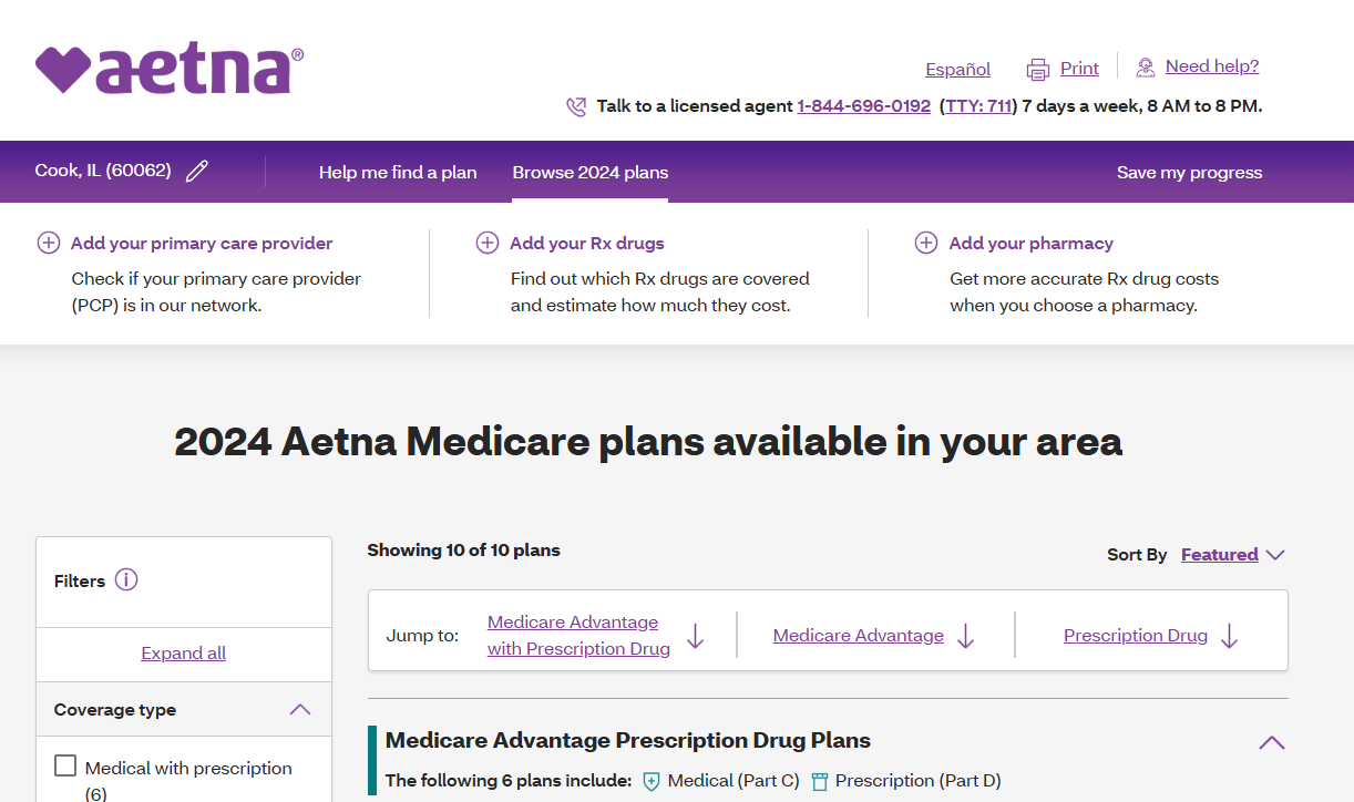
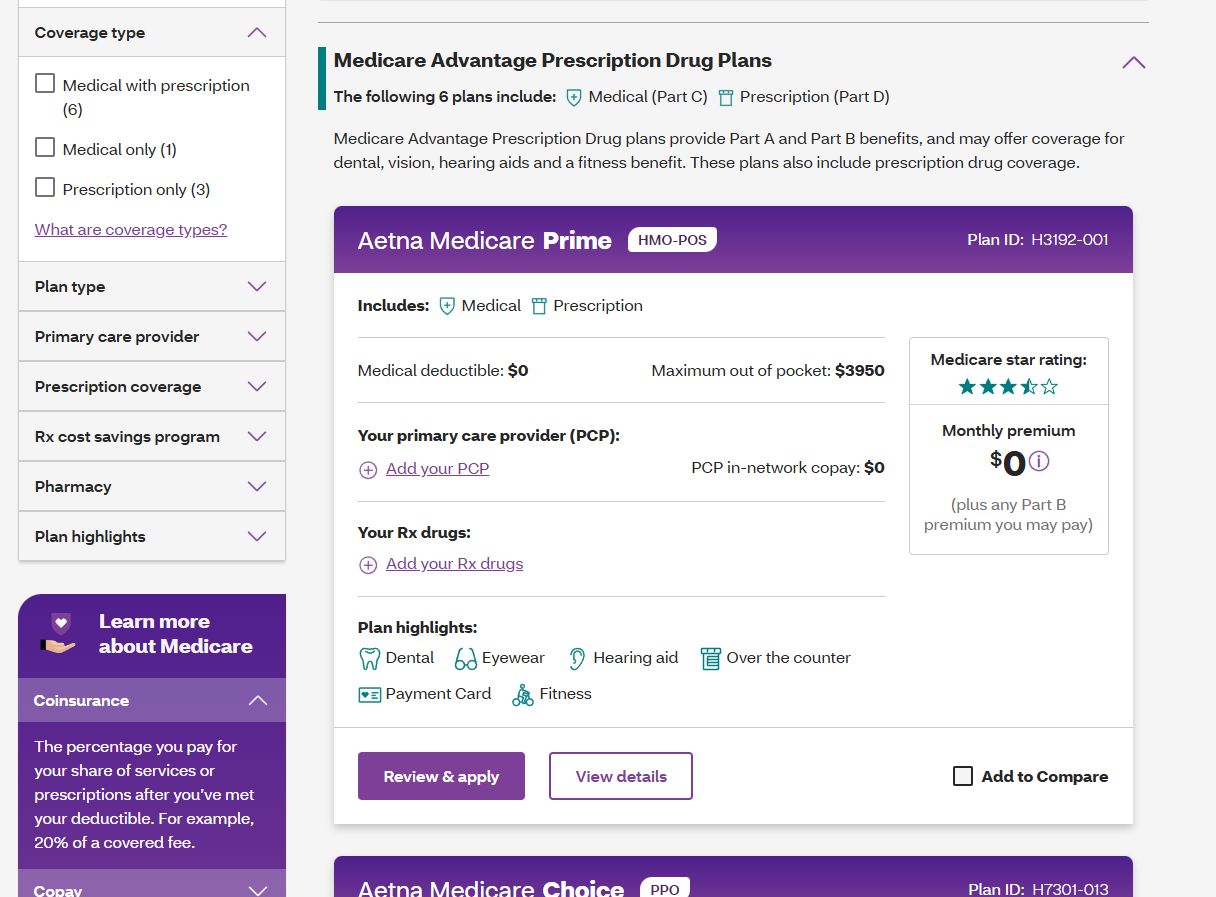
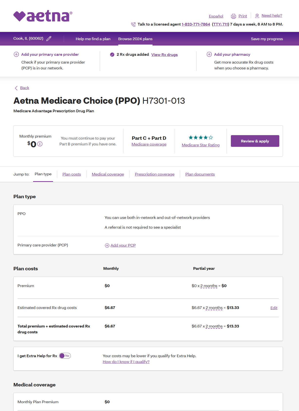
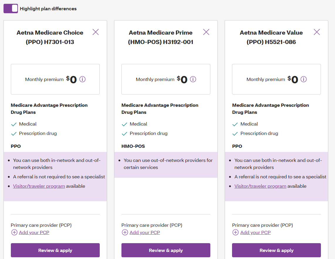
The core part of the test required users to navigate through the "shopping" experience which reflected this flow diagram:
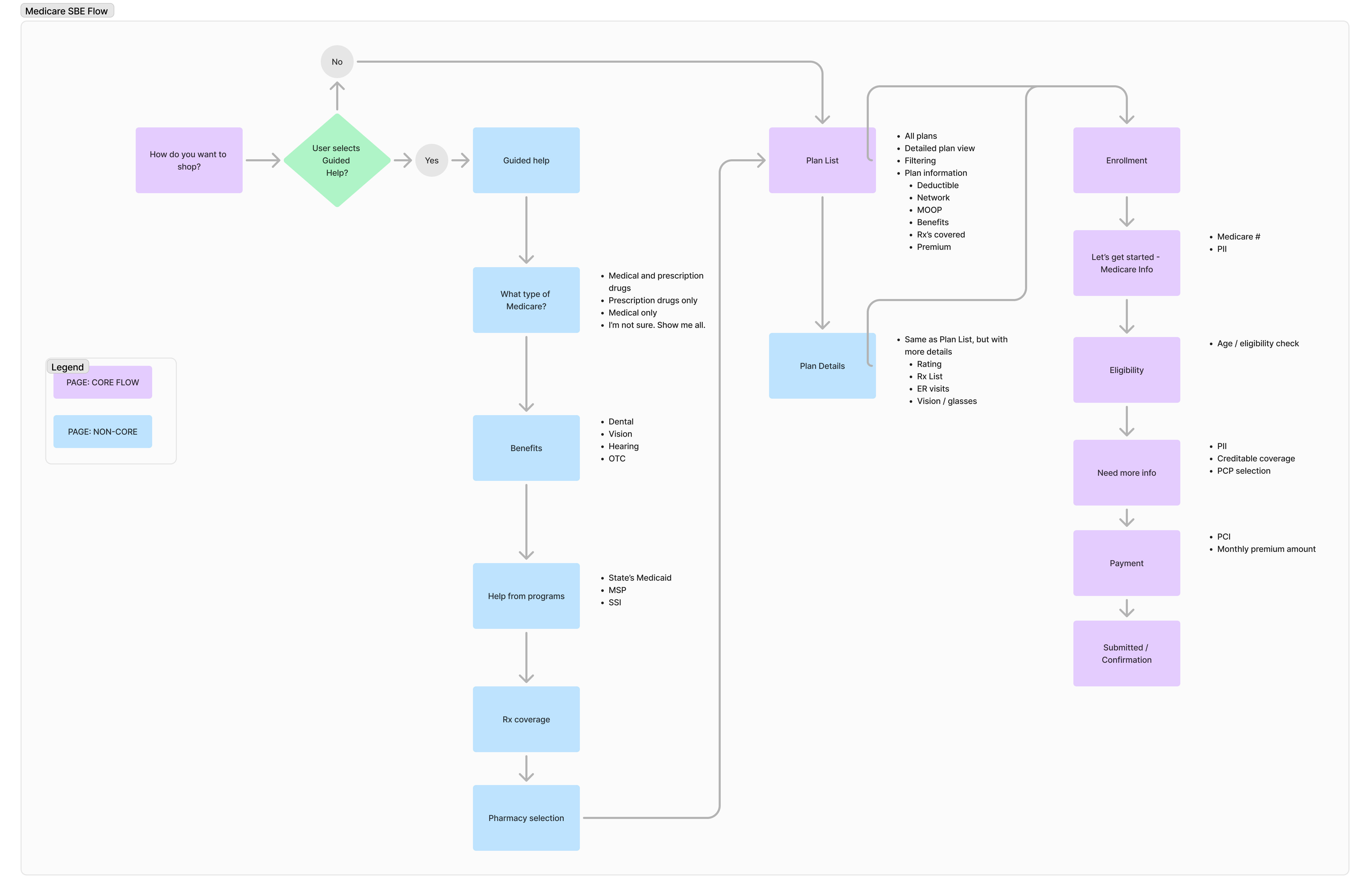
Process flow showing the steps for the Medicare insurance comparison and selection usability test (click to enlarge).
As users progressed in the given tasks I (as moderator) would ask them questions like the two below to get a sense of what caught their attention on a given page or to get an idea of what interactions they thought they might be able to take, given the signals and affordances communicated to them via the design of the page.
- What do you see on this page?
- What actions do you think you can take?
Depending on the structure of the test brief pauses were added where we might have taken a closer look at a given page to ask more pointed questions. In other cases, I left participants to complete the initial task without any interruptions and went back to previous pages or content areas after the user attempted to complete the task to explore more specific questions that the team might have had.
Some example questions asked during or towards the end of this test were:
- On a scale of 1 to 5, 1 meaning very difficult and 5 meaning very easy, how would you rate how easy or difficult it was to complete this task? Why did you give that rating?
- (on specific page) What would you expect to happen if you clicked on the Learn More button?
- (building a drug list page) What if you made a mistake, like adding the wrong medication to your list, what would you do?
- Why do you think you are being asked to select your pharmacy on this page?
- How would you determine if a plan covers your prescription?
A modified System Usability Scale (SUS) questionnare was filled out by participants for this study, however, the score wasn't as important of a data point to us compared to the rationale behind the rating participants gave.
Analysis
Our major learnings for this test were:
- Users were able to successfully navigate through the experience without any major pain points.
- Users appreciated the breadth of information shown on the plan details page.
- Users found the plan side-by-side comparison view very useful.
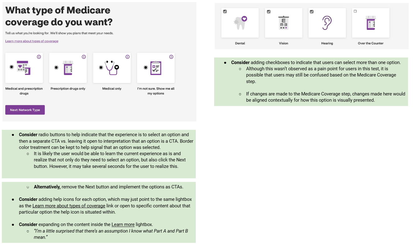
Additional specific design considerations were called out on a variety of pages and content areas based on the feedback provided by the participants as well as general observations as they interacted with the experience.
Interestingly, most participants failed to completely navigate through the guided help portion of the experience. However, all participants were able to understand the key plan listing and details pages.
